Spotify
Spotify’s design relies heavily on deep blacks, dark greys, and its signature vibrant green (#1DB954) for accents and buttons.
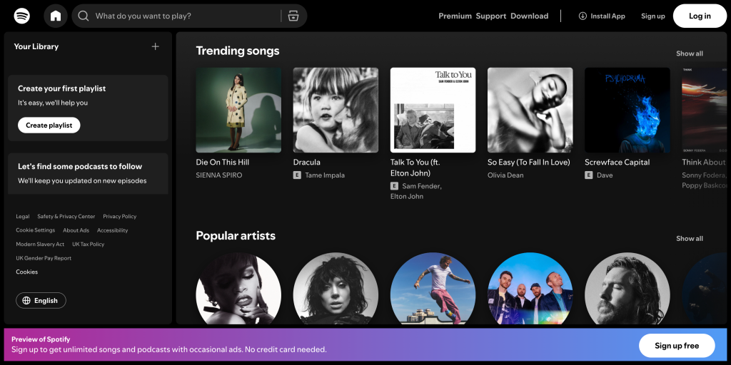
The dark background enhances the visual contrast and gives a premium, immersive feel, especially for music and media. The bright green accent colour instantly draws attention to key actions like “Sign Up” or “Play.” This limited but powerful palette builds strong brand recognition while maintaining visual consistency across devices.
Leave a Reply