Airbnb
Airbnb’s colour palette combines soft whites, warm greys, and its signature Rausch pink (#FF385C).
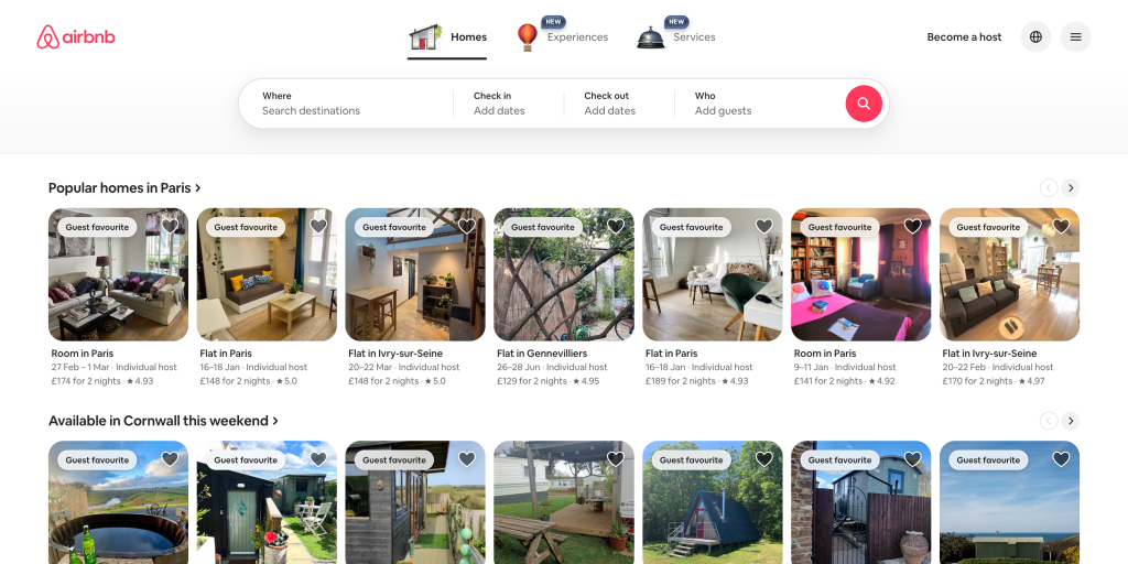
The warm pink accent gives the interface a friendly and welcoming tone, reflecting Airbnb’s brand message of belonging. The muted neutrals keep the layout elegant and professional, while the bright accent guides the user’s eyes toward important CTAs and highlights. The overall balance of warmth and minimalism enhances trust and usability.
Leave a Reply