Reflective Write Up – Alf’s Cycle
I chose Alf’s Cycles as the focus for my small business website project. Before designing or developing anything, I began by imagining a story—the story of a man named Alf.
Story Building
Alf was someone with a lifelong passion for bicycles and a natural warmth that made him well loved within his community. He taught himself everything he knew about cycles, and over time, neighbours began turning to him whenever their bikes needed repairing. What started as simple favors gradually grew into something bigger.
As his reputation spread, Alf opened a small workshop under his own name—Alf’s Cycles. He never relied on advertising; instead, his honesty, skill, and word-of-mouth built the business for him. People trusted his advice and valued his craftsmanship, returning not just for repairs, but for the reassurance that they were in good hands.
Over time, Alf’s workshop became more than just a business—it became a local institution. As the years passed, his passion, values, and love for cycling were passed down to the next generation, allowing Alf’s legacy to continue and the business to thrive for over 40 years.
The Mission
I began the project by outlining the basic requirements to gain a clear understanding of what I was designing. The story I had created naturally shaped the theme of the website, influencing how it should feel and look. As the concept developed, I found myself emotionally connected to the narrative behind it.
The goal was to create a design that felt meaningful and emotionally driven—one that told a story while still respecting the realities of a business. Rather than pushing users toward a purchase, the intention was to invite them to explore, reflect, and decide for themselves what they wanted to engage with. The website was designed to guide users gently, allowing the story, values, and atmosphere of the business to lead the experience.
Content Theme
With this emotional foundation in place, I began writing content that aligned closely with the project’s requirements. I was careful to avoid overly sales-focused language, instead choosing words that felt local, personal, and rich in meaning. My aim was to evoke emotion and build trust in Alf’s legacy, highlighting the strength and authenticity of a business that has endured for decades. That sense of trust felt essential to the experience I wanted to create.
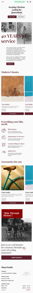
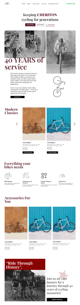
Visual Theme
At this stage, I had established a strong foundation for what the website represented and the overall theme it needed to convey. I began creating a list of keywords to guide the visual and emotional direction of the design—terms such as bold, retro, and strong; a trusted reputation within the town; a distinctly local feel; black and white pictures; oil pastel colours; vintage aesthetics; polite and down-to-earth character; a sense of premium quality; community involvement; indie music influences; classic foundations with subtle modern touches and many more. I wanted to capture the feel of these elements and reflect it in the site’s design.
Font Typefaces
To deliver a classic and elegant experience while establishing an emotional connection, I chose Libre Baskerville, a serif typeface for titles. As the site focuses on storytelling and heritage branding, this font felt especially appropriate and well aligned with the overall theme.
For comfortable reading across longer paragraphs of text, I chose the Inter typeface. Its clean, calm, and highly legible design complements the overall theme, providing a modern balance to the classic aesthetic while ensuring a relaxed and accessible reading experience.
Colors
Primary Color
I explored lots of colors that represent something like wine, leather, aged woods, rusted iron. I came across colors such as Deep green forest (#1f3d2b), Oxford blue (#1e2a38), leather brown (#6b4f2a), slate blue gray (#4a5d73). But I was hooked into the deep burgundy (#5c1f2b) because it felt more heritage, more emotional without being sentimental and strong more like an old British brand.
Supporting Colors
For the background color, a very light gray #f0f0f0. Since Pure white (#ffffff) can feel harsh, especially for reading text. #f0f0f0 is softer, so it’s easier on the eyes, especially for long-form content.Light gray is neutral, so it works well with almost any text color, image, or accent color. It won’t clash with design
And for the paragraph ,a dark gray (#1a1a1acc) is easier on the eyes but still highly readable. The opacity makes the text slightly transparent, blending subtly with the background.
Wireframes & IA along the side
While shaping the visual elements and narrative of the site, I was also planning the information architecture and wireframes in parallel. As the website was intended to function as a simple marketing tool, I deliberately kept the number of sections and elements to a minimum. I was careful to ensure the site did not resemble an ecommerce platform, as no products were being sold. Instead, the focus was on communicating Alf’s legacy and the quality of products and services the business has delivered over the years.
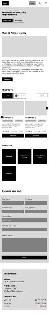
With a mobile-first mindset, I started by creating low-fidelity wireframes in Figma to define the content structure and establish the core layout. From there, I gradually explored different design styles. Drawing strong inspiration from classic British design aesthetics, I found this direction to be a natural and fitting choice for the project.
Development with Design
Once the homepage was finalized, I felt confident in the website’s visual direction. Instead of producing detailed designs for every page—which would have been time-consuming—I moved straight into development for the remaining pages while keeping the design theme consistent. By this stage, the core structure, layout, and components were already in place, allowing reused components to naturally maintain consistency across the site.
Since I was more accustomed to building sites with classes, working on a project that required using classes only when absolutely necessary and targeting html elements became a challenge. I was also more comfortable with a desktop-first approach, so shifting to mobile-first pushed me further out of my comfort zone.
The layout and visual style of the site were also fairly complex, which meant the codebase could become harder to maintain. Still, I chose to take the risk. The emotional depth of the design mattered to me, and I felt it was worth embracing the challenge to preserve that feeling.
Leave a Reply