A Beginner’s Guide to Atomic Design and BEM
Atomic Design was proposed by Brad Frost as a concept of considering the user interface design as a system consisting of smaller components instead of individual pages.
Since websites and apps began to be larger and had to support a variety of devices, designing page by page began to become an issue. The appearance of such items as buttons or forms on various pages was often slightly different, and there were repeated elements, and it became more difficult to maintain everything the same.
To address this, Atomic Design recommends the decomposition of interfaces into small reusable components which are put together to construct entire pages. This simplifies the maintenance of designs, consistency, and joint work of a designer and developer.
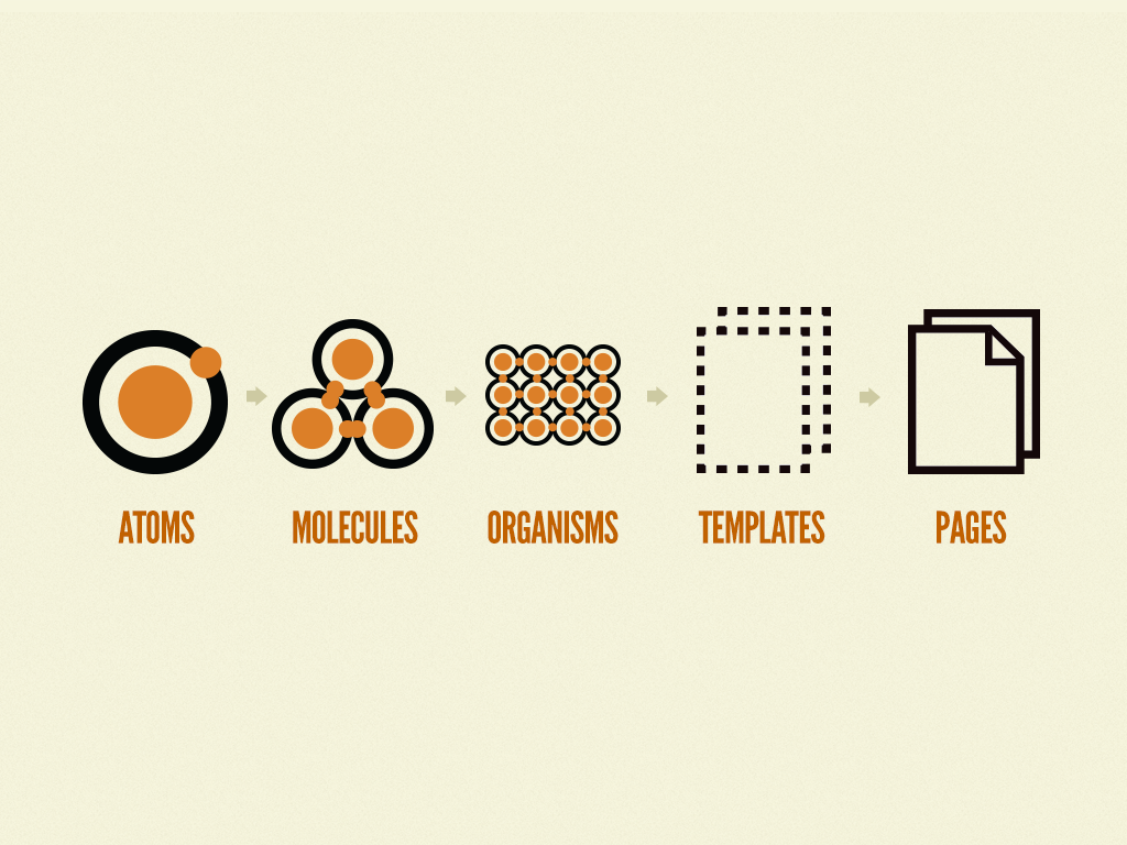
Brad Frost organized Atomic Design into levels of hierarchy that were based on chemistry. The idea is that big user interfaces are composed of smaller components, in the same way that physical matter is composed of atoms.
The five stages are:
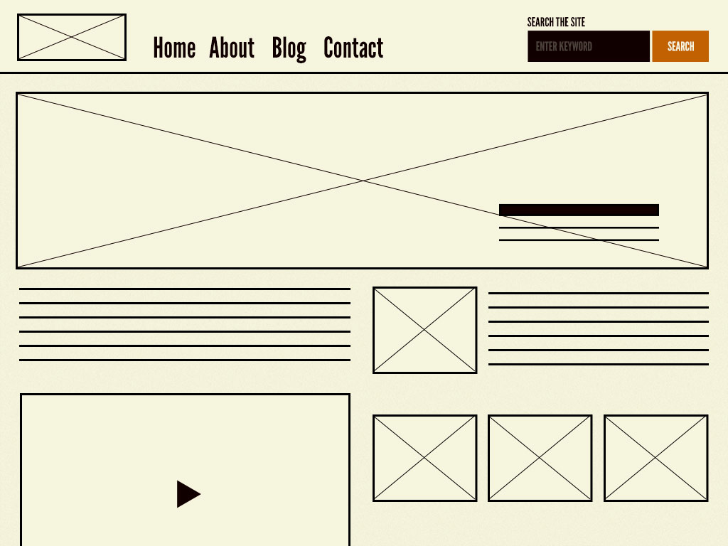
Atoms – The tiniest parts of a UI, i.e. buttons, labels, inputs, colors, fonts.
Molecules – This is aimed at small groups of atoms that combine to execute a simple task, such as a search form consisting of an input field and a button.
Organisms – Bigger entities formed as a result of amalgamating molecules and atoms: a site header with a logo, a menu, and a search engine.
Templates – Page layouts which organize various organisms into a design.
Pages – Templates with actual content, the last stage of the redesign demonstrates the appearance of the design to the users
Atoms
In Atomic Design, atoms are the smallest building blocks of a user interface. They include basic HTML elements such as buttons, input fields, labels, and headings, as well as design tokens like colors, typography styles, spacing, and icons.
Each atom has a clear and simple purpose. For example, a button triggers an action, a label explains an input field, and colors help communicate meaning or visual hierarchy.
Even though atoms are simple, they are important because they create consistency across a design system. When these elements are clearly defined, designers and developers can reuse them instead of creating new ones for every page. This reduces repetition, makes the interface easier to maintain, and keeps the design visually consistent.
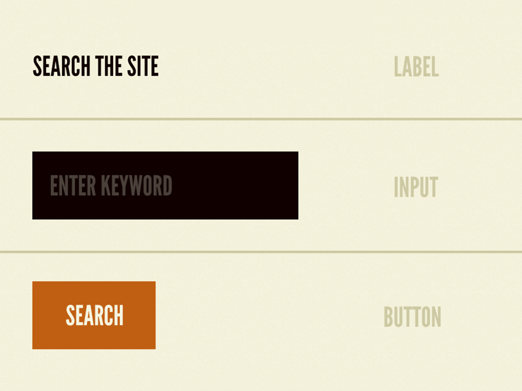
Atoms are small, but they form the foundation for everything else in Atomic Design. For example from the image – label, input field & search button are the atoms.
Molecules
The next level of Atomic Design is molecules. Molecules are small groupings of atoms unlike atoms which are separate elements which cooperate as one unit. They assemble several atoms into a little bit more complicated, reusable parts.
Or, to use an example, a search form molecule may consist of text input atom, label atom and button atom, which are all a part of the same element.
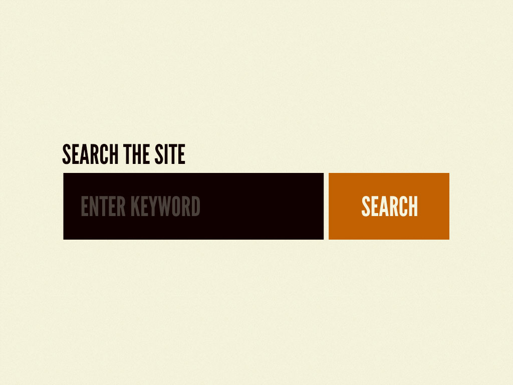
Molecules assist designers and developers to observe how individual atoms interact to create meaningful UI patterns. Still being simple, molecules can display structure and function in a manner that individual atoms are incapable of doing.
Standardization of molecules also makes interfaces more standardized, maintainable and faster to construct. It can be compared to chemistry: atoms are joined together to create molecules, which are further united to create larger structures. Molecules are used in UI design as the initial step to create separate parts into useful, functional ones.
Organisms
The more complex UI components are the organisms, formed by association of groups of molecules and atoms. They are independent and self-contained parts of an interface. As opposed to molecules, which are simple, organisms construct meaningful, reusable components, which compose larger components of a page.
A header organism would thus have a logo atom, a navigation molecule, and a search form molecule–that would form a single functional section.
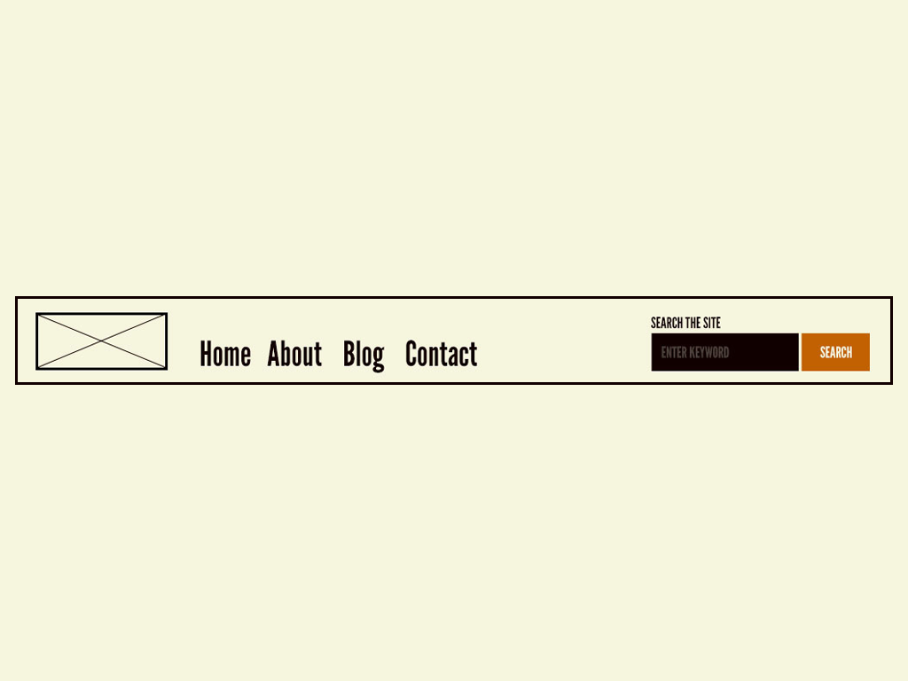
Organisms reveal the interactions of components. They can be used across pages, they can be used to maintain design consistency and complex interfaces to be built easily.
Fundamentally, organisms, in essence, serve as a facilitator between smaller units (atoms and molecules) and larger templates (pages), to build recognizable, functional parts of a digital product.
Templates
The templates establish the page-level design by organizing atoms, molecules and organisms into a unified design. Templates, as opposed to organisms, which are self-contained parts, are concerned with the general location, hierarchy and interrelations of sections, but not with individual parts.
Templates serve as a guide to the interface that displays how various parts will be assembled prior to the addition of actual content. As an example, a homepage template may contain a header organism, a hero section organism, a feature list organism and a footer organism.
Templates are important so as to maintain consistency of designs within pages and ensure that the interface is expandable. They steal reusable elements and fit them into a workable structure, which is to be filled with actual content to create whole functional pages.
Pages
The last step requires filling in templates with actual content to have fully working, physical user interfaces. As templates describe the structure and layout, pages demonstrate the appearance and behaviour of the interface using real data.
As an example: In a home page, there are real images, text, and links on the header, feature list, hero section, and footer.

Importance of pages is that they are used to show how the components interact in the context and testing of the interface can be done to test its usability, consistency and visual harmony. They constitute the ultimate and user-oriented phase of all the atomic design phases.
In actual sense, pages make the system come to life, whether it is atoms, molecules, organisms and templates, displaying all the user experience.
CSS Naming Conventions
At this point we will read about CSS Conventions. CSS naming convention assists in the writing of readable and scalable CSS that is maintainable by the developer. Rather than having class names that are randomly chosen and/or ambiguous, developers have a pattern that is easily readable by the teams on how the styles are employed to various parts of the interface. This method is particularly necessary in large projects that have numerous developers on the platform.
Consistent naming rules help developers to escape problems of style duplication, random overrides and sloppy stylesheets. It also assists in connecting the code with the design systems, and reusable components of the UI can be created more easily.
The following are some of the common CSS naming conventions:
BEM (Block Element Modifier) – is concerned with modular elements and explicit relationships among elements.
OOCSS (Object-Oriented CSS) – isolates structure and skin in favor of reusable styles.
SMACSS (Scalable and Modular Architecture of CSS) – is a method of grouping styles into sections such as base, layout, module, and state.
ITCSS (Inverted Triangle CSS) – is a scale of CSS, where the generic is structured into specific to enhance scalability.
BEM (Block Element Modifier)
BEM has been found to be preferred to other CSS conventions due to its clear and consistent approach to naming of UI components. It is easy to comprehend how various components of a component relate to each other. This assists programmers in preventing conflicts in style and makes CSS more manageable and readable. BEM is compatible with Atomic Design, as the two methods concentrate on the construction of interfaces by means of small and reusable elements. BEM is simpler to learn as a beginner since it does not appeal to sophisticated CSS structure as much it features simple naming rules. It breaks down a component into three: Block, Element, and Modifier.
Block
A block is a reusable and independent element of the interface. It is the primary container which can exist independently. They can be such components as a card, a navigation menu, or a button.
Example: .card, .nav, .button
Element
An element is a component of a block that fulfills a particular purpose in it. Elements do not exist in isolation, but are in a constant relationship with their block. In BEM, the elements are written in two underscores ().
Example: .card__title, .card__image, .nav__item
Modifier
A modifier is a variation or other form of a block or an element. It is applied when there should be a little different look or behavior of a component. Two hyphens (–) are used to represent the use of modifiers.
Example: .button--primary, .card--featured
Together, Block, Element, and Modifier create a clear structure for CSS, making it easier to understand components and maintain styles in larger projects.
I’ve created a webpage entirely structured using the BEM methodology. The page serves as a cheatsheet, explaining all BEM components through a Product Card example. You can check out the GitHub repository and view the live site. I find the topic becomes much clearer when demonstrated with code and by examining the CSS files. Also, please take your time to read the README file, which provides a more detailed explanation of how BEM is applied in the example.
Leave a Reply